

Data Science Math 101: Functions

If you have a computer science background or at least some experience writing programs, chances are you’re familiar with the concept of functions. In math, functions tend to be a bit more abstract but conceptually they are the same. If you don’t have such experience at all, perfect. Read on.
Generally speaking, a function is an expression that defines relationships between variables. Typically, it takes one or more variables as inputs, applies them to the expression, and returns an output variable.
Here’s an example of such an expression:
There are two variables at play here. y is the output variable which is the result of the expression x + 1, where x is the input to that expression. Or in other words, for any x-value, y equals to that x-value added by 1.
When x = 1, then y = 2. When x = 2, then y = 3. As we can see, as x grows, y grows as well and the relationship between the two is encoded in the expression. It’s also important to note that y grows by the same rate, relative to x. It grows linearly.
To make things look a bit more fancy, we can use a different way of writing this expression by replacing y with f(x), which stands for “function f of x”.
Something we’ll often see as well is that functions are plotted so one can visualize how they behave with different input data.
Here’s what our simple expression looks like when plotted on a coordinate plane:
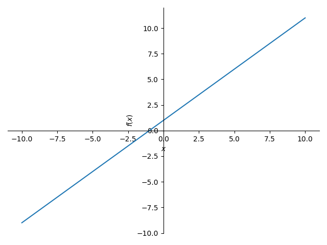
The x-axis (the horizontal line) represents the input data. The y-axis (the vertical line) represents the output data. If we painted a little dot for every y-value given any x-value, then we’ll get this nice straight diagonal line.
However, functions aren’t always linear. Take the following expression:
As we can see, x is raised to the power of 2. So for any x-value, y is that value squared added by 1. When x = 2, then y = 5. When x = 3, then y = 10 and so on. Notice how y grows much faster than in the previous function. It grows exponentially, so this is an exponential function.
Let’s have a look at how this changes the graph:
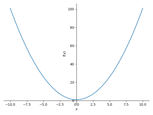
We no longer have a straight continuous line. Instead, we have curve that goes very steep very quickly. Just as for anything in math, this shape has a fancy name too. It’s called a parabola. So if your crypto Twitter feed says that a coin goes parabolic, you now know what they are referring to. This graph also nicely illustrates how, given any negative x-value, the resulting y-value is always positive (because x is raised to the power of 2).
Let’s do this one more time with another function:
Now, any x-value will be cubed (raised to the power of 3). This should make the function grow even faster. Again, we can illustrate this nicely by plotting a graph.

At a first glance, this looks like the function isn’t growing any faster than the previous one. In fact, the curve looks way steadier, so what’s going on here? Take a closer look at the coordinate plane and its values. While the previous function returns 100 for an input 10, this function returns 1000 for the same input!
Up next…
You’ve entered the rabbit hole of Data Science Math 101. Next, we’ll explore Limits.
